 ayumi
ayumi
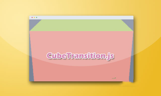
cubeTransition.js是一款超酷3D立方体页面切换过渡动画jQuery插件。该插件通过CSS 3D transforms 和 CSS Animations来制作平滑的立方体过渡动画特效。
使用方法
在页面中引入jquery.min.js,jquery.touchSwipe.js(用于移动触摸事件),mousewheel.js(用于鼠标滚动事件),和cubeTransition.js文件。
<script src='js/jquery.min.js'></script>
<script src='js/mousewheel.js'></script>
<script src="js/jquery.touchSwipe.js"></script>
<script src="js/cubeTransition.js"></script>
HTML结构
基本的页面HTML结构如下:
<div id="cubeTransition">
  <div><h2>cubeTransition.js</h2></div>
  <div><h2>Elegant,</h2></div>
  <div><h2>exected!</h2></div>
  <div><h2>Simple.</h2></div>
</div>
CSS样式
为界面添加下面的基本CSS样式:
* {
  margin: 0;
  padding: 0;
}

html, body {
  overflow: hidden;
  height: 100%;
}

#cubeTransition {
  position: relative;
  width: 100%;
  height: 100%;
  -webkit-perspective: 1200px;
  -moz-perspective: 1200px;
  perspective: 1200px;
}

#cubeTransition div {
  min-height: 100%;
  width: 100%;
  position: absolute;
  top: 0;
  left: 0;
  backface-visibility: hidden;
  transform: translate3d(0, 0, 0);
  transform-style: preserve-3d;
  font-size: 5em;
  color: #fff;
  display: none;
}

#cubeTransition h2 {
  position: relative;
  top: 200px;
  margin: 0;
  font-size: 1.5em;
  text-align: center;
  text-shadow: 1px 1px 0px rgba( 0, 0, 0, 0.1 );
}

.top { z-index: 9999 }

.rotateCubeTopOut {
  transform-origin: 50% 100%;
  animation: rotateCubeTopOut .6s both ease-in;
}

.rotateCubeTopIn {
  transform-origin: 50% 0%;
  animation: rotateCubeTopIn .6s both ease-in;
}

.rotateCubeBottomOut {
  transform-origin: 50% 0%;
  animation: rotateCubeBottomOut .6s both ease-in;
}

.rotateCubeBottomIn {
  transform-origin: 50% 100%;
  animation: rotateCubeBottomIn .6s both ease-in;
}

@keyframes
rotateCubeTopOut {
  50% {
    animation-timing-function: ease-out;
    transform: translateY(-50%) translateZ(-200px) rotateX(45deg);
  }
  100% {
    opacity: .3;
    transform: translateY(-100%) rotateX(90deg);
  }
}

@keyframes
rotateCubeTopIn {
  0% {
    opacity: .3;
    transform: translateY(100%) rotateX(-90deg);
  }
  50% {
    animation-timing-function: ease-out;
    transform: translateY(50%) translateZ(-200px) rotateX(-45deg);
  }
}

@keyframes
rotateCubeBottomOut {
  50% {
    animation-timing-function: ease-out;
    transform: translateY(50%) translateZ(-200px) rotateX(-45deg);
  }
  100% {
    opacity: .3;
    transform: translateY(100%) rotateX(-90deg);
  }
}

@keyframes
rotateCubeBottomIn {
  0% {
    opacity: .3;
    transform: translateY(-100%) rotateX(90deg);
  }
   50% {
    animation-timing-function: ease-out;
    transform: translateY(-50%) translateZ(-200px) rotateX(45deg);
  }
}
cubeTransition.js 3D立方体页面切换过渡jQuery插件的github地址为:https://github.com/HTML50/cubeTransition.js
版权声明
文章来源: https://www.uihtm.com/jquery/9364.html
版权说明:仅限用于学习和研究目的;不得将上述内容用于商业或者非法用途,否则,一切后果请用户自负。我们非常重视版权问题,如有侵权请邮件(44784009#qq.com)与我们联系处理。敬请谅解!