 ayumi
ayumi
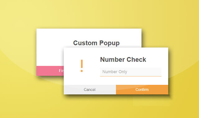
x0popup是一款用于替代原生警告框、消息框和确认框的纯js插件。通过该js插件可以制作出非常炫酷的警告框、消息框和确认框效果。它的特点还有:
- 轻量级,压缩后的版本小于4kb。
- 纯js,无外部依赖库。
- 扁平化风格设计。
- 允许用户自定义主题。

安装
可以通过npm或bower来安装该对话框插件。
npm install x0popup
bower install x0popup
使用方法
在页面中引入x0popup.min.css和x0popup.min.js文件。
<link rel="stylesheet" href="path/to/css/x0popup.min.css">
<script src="path/to/js/x0popup.min.js"></script>
初始化插件
要制作一个简单的弹出消息框,可以使用下面的代码:
x0p('Message', 'Hello world!');
要制作一个确认对话框,可以使用下面的代码:
x0p('Confirmation', 'Are you sure?', 'warning');
要制作一个消息提示框,可以使用下面的代码:
x0p('Enter Your Name', null, 'input',
function(button, text) {
    if(button == 'info') {
        x0p('Congratulations',
            'Your name is ' + text + '!',
            'ok', false);
    }
    if(button == 'cancel') {
        x0p('Canceled',
            'You canceled input.',
            'error', false);
    }
});
配置参数
x0popup插件的配置参数如下:
| 参数 | 类型 | 默认值 | 描述 |
| title | string | 'Message' | 提示框的标题。 |
| text | string | null | 提示框的文本。 |
| theme | string | 'default' | 提示框的主题,目前只有一种主题,你可以在'css/x0popup.default.css'文件中编写自己的主题。 |
| overlay | bool | true | 是否显示遮罩层。 |
| width | string | '90%' | 提示框的宽度。 |
| height | string | '50%' | 提示框的高度。 |
| maxWidth | string | '450px' | 提示框的最大宽度。 |
| maxHeight | string | '200px' | 提示框的最大高度。 |
| type | string | 'text' | 类型:text, input, ok, warning, info, error。 |
| icon | string | null | 图标:ok, warning, info, error, custom。 |
| iconURL | string | null | 当icon类型为cusotm时,使用该参数来指定图标的url。 |
| inputType | string | null | 输入框类型:text, password。 |
| inputValue | string | null | 输入框的默认值。 |
| inputPlaceholder | string | null | 输入框的占位文本。 |
| inputColor | string | null | 输入框的文本颜色。 |
| inputValidator | function | null | 参数: button。返回一条提示错误的信息。cancel按钮不会触发这个函数。 |
| showCancelButton | bool | null | 是否显示cancel按钮。 |
| buttons | array | null | 按钮数组。 |
| autoClose | integer | null | 对话框在指定的时间之后自动关闭。 |
| html | bool | false | 如果设置为false,html代码在置入对话框之前将被编码。 |
| animation | bool | true | 是否显示动画。 |
| animationType | string | 'pop' | 动画类型:pop, slideUp, slideDown, fadeIn。 |
| overlayAnimation | bool | true | Set it to false will help if you want to show several popups with overlay continuously. |
| callback | function | null | 回调函数。 |
按钮
按钮的可取值有:ok, warning, info, error, cancel, timeout。除了timeout会自动触发,其它的由用户来触发。
单个按钮的结构如下:
| 参数 | 类型 | 默认值 | 描述 |
| type | string | null | 可取值: ok, warning, info, error, cancel。 |
| text | string | null | 如果设置为null,按钮上的文本将被设置为默认值。 |
| showLoading | bool | null | 如果设置为true,在按钮被点击时,对话框会显示一个loading动画,而不是直接关闭。 |
x0popup对话框插件的github地址为:https://github.com/gao-sun/x0popup
版权声明
文章来源: https://www.uihtm.com/jquery/9285.html
版权说明:仅限用于学习和研究目的;不得将上述内容用于商业或者非法用途,否则,一切后果请用户自负。我们非常重视版权问题,如有侵权请邮件(44784009#qq.com)与我们联系处理。敬请谅解!