 ayumi
ayumi
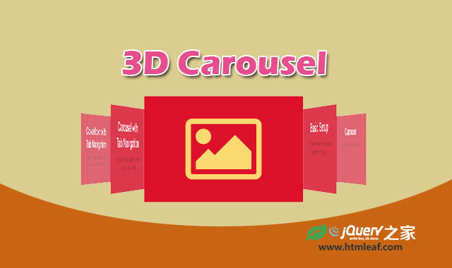
jquery-flipster是一款效果非常炫酷的响应式支持触摸屏的3D旋转木马特效jQuery插件。该旋转木马特效基于CSS3 3D transform制作,效果和CoverFlow类似。该插件是响应式的,旋转木马会自动居中显示。并且它支持移动手机的触摸屏。如果浏览器不支持CSS3 3D transform,该旋转木马会自动回退显示为平面图片。
可以通过键盘的方向键,鼠标和前后导航按钮来控制该旋转木马的动画。
使用方法
使用该旋转木马插件需要引入jQuery和flipster.js、flipster.css文件。
<link rel="stylesheet" href="css/flipster.css">
<script src="jquery/1.10.2/jquery.min.js"></script>
<script src="/js/jquery.flipster.js"></script>
HTML结构
该旋转木马特效使用一个<div>来包裹一个图片无序列表。
<div class="flipster">
    <ul>
        <li><img src="" alt="" /></li>
        ...
    </ul>
</div>
初始化插件
$(function(){ $('.flipster').flipster(); });
配置参数
$(function(){
    $('.flipster').flipster({
        itemContainer:      'ul', // Container for the flippin' items.
        itemSelector:       'li', // Selector for children of itemContainer to flip
        style:              'coverflow', // Switch between 'coverflow' or 'carousel' display styles
        start:              'center', // Starting item. Set to 0 to start at the first, 'center' to start in the middle or the index of the item you want to start with.

        enableKeyboard:     true, // Enable left/right arrow navigation
        enableMousewheel:   true, // Enable scrollwheel navigation (up = left, down = right)
        enableTouch:        true, // Enable swipe navigation for touch devices

        enableNav:          false, // If true, flipster will insert an unordered list of the slides
        enableNavButtons:   false, // If true, flipster will insert Previous / Next buttons

        onItemSwitch:       function(){}, // Callback function when items are switches
    }
});
-
itemContainer:旋转木马元素项容器,默认为
ul。 -
itemSelector:itemContainer的子元素,默认为
li。 - style:在“coverflow”和“carousel”模式之间切换,默认为“coverflow”模式。
- start:设置旋转木马的开始项并使它居中显示。
-
enableKeyboard:是否允许使用左右箭头按键来导航旋转木马,默认为
true。 -
enableMousewheel:是否允许使用鼠标滚动来导航旋转木马,默认为
true。 -
enableTouch:是否允许触摸滑动来导航旋转木马,默认为
true。 -
enableNav:如果设置为
true,插件会插入一个项目类别和标题的无序列表来制作导航效果。默认为false。 -
enableNavButtons:如果设置为
true,插件会插入“Previous”和“Next”链接来前后导航旋转木马。
回调函数
onItemSwitch:当旋转木马进行切换时被调用。
高级应用
导航
该旋转木马插件可以为每一个旋转木马项创建一个链接的无序列表。需要在每一个<li>元素上设置ID和title属性,然后设置enableNav: true。例如:
<div class="flipster">
    <ul class="flip-items">
        <li id="Item-1" title="Item 1 Title">
            <img src="" alt="" />
        </li>
        <li id="Item-2" title="Item 2 Title">
            <img src="" />
        </li>
        ...
  </ul>
</div>
将会输出下面的代码:
<ul class="flipster-nav">
<li class="flip-nav-item no-category"><a href="#Item-1" class="flip-nav-item-link">Item 1 Title</a></li>
<li class="flip-nav-item no-category"><a href="#Item-2" class="flip-nav-item-link">Item 2 Title</a></li>...
</ul>
分类
导航列表也可以进行类别分组。需要在每一个<li>元素上设置data-flip-category属性以及ID和title属性,然后设置enableNav: true。例如:
<div class="flipster">
    <ul class="flip-items">
        <li id="Item-1" title="Item 1 Title" data-flip-category="Category 1">
            <img src="" alt="" />
        </li>
        <li id="Item-2" title="Item 2 Title" data-flip-category="Category 1">
            <img src="" />
        </li>
        <li id="Item-3" title="Item 3 Title" data-flip-category="Category 2">
            <img src="" />
        </li>
        <li id="Item-4" title="Item 4 Title" data-flip-category="Category 2">
            <img src="" />
        </li>
        <li id="Item-5" title="Item 5 Title">
            <img src="" />
        </li>
  </ul>
</div>
将会输出下面的代码:
<ul class="flipster-nav">
    <li class="flip-nav-category">
        <a href="#" class="flip-nav-category-link" data-flip-category="Category 1">Category 1</a>
        <ul class="flip-nav-items">
            <li class="flip-nav-item"><a href="#Item-1" class="flip-nav-item-link">Item 1</a></li>
            <li class="flip-nav-item"><a href="#Item-2" class="flip-nav-item-link">Item 2</a></li>
        </ul>
    </li>
    <li class="flip-nav-category">
        <a href="#" class="flip-nav-category-link" data-flip-category="Category 2">Category 2</a>
        <ul class="flip-nav-items">
            <li class="flip-nav-item"><a href="#Item-3" class="flip-nav-item-link">Item 3</a></li>
            <li class="flip-nav-item"><a href="#Item-4" class="flip-nav-item-link">Item 4</a></li>
        </ul>
    </li>
    <li class="flip-nav-item no-category">
        <a href="#Item-5" class="flip-nav-item-link">Item 5 Title</a>
    </li>
</ul>
浏览器兼容
已经测试的浏览器:
- Chrome (latest)
- Safari & Mobile Safari (latest)
- Firefox (latest) (no mousewheel, no box reflections)
- IE 10 (no mousewheel, no box reflections)
未经测试的浏览器:
- IE 8 & 9 (no 3D transforms, 'compatibility mode')
- IE <= 7
- Android browsers
- Opera
版权声明
文章来源: https://www.uihtm.com/jquery/8801.html
版权说明:仅限用于学习和研究目的;不得将上述内容用于商业或者非法用途,否则,一切后果请用户自负。我们非常重视版权问题,如有侵权请邮件(44784009#qq.com)与我们联系处理。敬请谅解!