flex 弹性布局
一. flex 解释
1、flex 布局 为 flexible BOX 的缩写 ,意思为 弹性布局。
2、块级元素和行内块级元素都可以使用flex布局
3、Webkit内核的浏览器,需要加上-webkit前缀。
二. flex 容器 属性
1、flex-direction
此属性决定主轴的方向
.flex{
	flex-direction: row; // (默认值) 主轴水平方向,从左往右	如图:
	flex-direction: row-reverse; // 主轴水平方向的逆方向,从右往左
	flex-direction: column; // 主轴为垂直方向,从上往下
	flex-direction: column-reverse; // 主轴为垂直方向的逆方向,从下往上
}

2、flex-wrap
此属性定义,如果一条轴线上排列不下,换行的方式
.flex{
	flex-wrap: nowrap; // (默认)不换行	如图:
	flex-wrap: wrap; // 正常换行 从上到下	如图:
	flex-wrap: wrap-reverse; // 逆方向换行 从下到上	如图:
}

3、flex-flow
此属性定义,是flex-direction和flex-wrap的方式;
.flex {
	flex-flow: <flex-direction>  空格 <flex-wrap>;
}
4、justify-content
此属性定义,项目在主轴上的对齐方式
.flex{
	justify-content: flex-start; // 左对齐(默认)
	justify-content: flex-end;	// 右对齐
	justify-content: center;	// 居中
	justify-content: space-between; // 两端对齐。且项目间间隔相等
	justify-content: space-around; // 每个项目两侧间隔相等,所以项目间 间隔 比项目与边框间间隔大一倍
	justify-content:  space-evenly; // 项目间间隔与项目与边框间 间隔均匀分配
}

4、align-items
此属性定义,项目在交叉轴上的对齐方式
.flex{
	align-items: flex-start; // 交叉轴的起点对齐
	align-items: flex-end; // 交叉轴的终点对齐
	align-items:center; // 交叉轴的中点对齐
	align-items: baseline; // 项目的第一行文字的基线对齐
	align-items: stretch; // (默认值) 如果项目未设置高度或设为auto ,将充满整父级容器高度
}

5、align-content
此属性定义,多个项目多根轴线的对齐方式,只有一个轴线时没有作用
.flex{
	align-content: flex-start; // 与交叉轴的起点对齐。
	align-content: flex-end:// 与交叉轴的终点对齐。
	align-content: center:// 与交叉轴的中点对齐。
	align-content: space-between:// 与交叉轴两端对齐,轴线之间的间隔平均分布。
	align-content: space-around:// 每根轴线两侧的间隔都相等。所以,轴线之间的间隔比轴线与边框的间隔大一倍。
	align-content: stretch; // (默认值)轴线占满整个交叉轴。
}

以上的属性都是容器的属性
三. flex 项目 属性
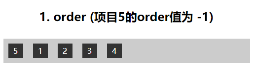
1、order
此属性决定项目的排列顺序,数值越小。排列越靠前。
.box{
	order: number; // 默认为 0 ,要讲哪个项目向前移动 将其order设置为负数。
}
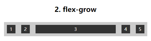
2、flex-grow
此属性决定项目的放大比列。
.box{
	flex-grow: 5; // 默认为 0
}
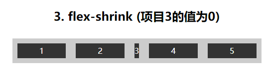
3、flex-shrink
此属性决定项目的缩小比列。
.item {
  flex-shrink: number; // 默认为1.要将哪个项目缩小 值设为0 ;
}
3、flex-basis
此属性定义 在分配多余空间之前,项目占据的主轴空间(main size)。浏览器根据这个属性,计算主轴是否有多余空间。它的默认值为auto,即项目的本来大小。
4、flex
此属性定义为 flex-grow, flex-shrink 和 flex-basis的简写,默认值为0 1 auto。后两个属性可选。
.item{
	flex: flex-grow flex-shrink flex-basis; // 简写方式
}
5、align-self
此属性允许单个项目有与其他项目不一样的对齐方式,可覆盖align-items属性。默认值为auto,表示继承父元素的align-items属性,如果没有父元素,则等同于stretch。
.item{
 	align-self: auto;
 	align-self: flex-start;
 	align-self: flex-end;
 	align-self: center;
 	align-self: baseline;
 	align-self: stretch;
}

演示html
<!DOCTYPE html>
<html>

<head>
    <meta charset="UTF-8">
    <meta name="viewport" content="width=device-width, initial-scale=1.0">
    <meta http-equiv="X-UA-Compatible" content="ie=edge">
    <title>flex布局</title>
    <style>
        h2 {
            text-align: center;
        }

        .flex {
            width: 500px;
            margin: 30px auto;
            background: #cccccc;
        }

        .box {
            width: 30px;
            height: 30px;
            margin: 10px;
            background: #333;
            text-align: center;
            line-height: 30px;
            color: #fff;
        }

        .flex1 {
            display: flex;
            flex-direction: row;
        }

        .flex2 {
            display: flex;
            flex-direction: row-reverse;
        }

        .flex3 {
            display: flex;
            flex-direction: column;
        }

        .flex4 {
            display: flex;
            flex-direction: column-reverse;
        }

        .flex5 {
            display: flex;
            flex-wrap: nowrap;
        }

        .flex6 {
            display: flex;
            flex-wrap: wrap;
        }

        .flex7 {
            display: flex;
            flex-wrap: wrap-reverse;
        }

        .flex8 {
            display: flex;
            justify-content: flex-start;
        }

        .flex9 {
            display: flex;
            justify-content: flex-end;
        }

        .flex10 {
            display: flex;
            justify-content: center;
        }

        .flex11 {
            display: flex;
            justify-content: space-between;
        }

        .flex12 {
            display: flex;
            justify-content: space-around;
        }

        .flex13 {
            display: flex;
            justify-content: space-evenly;
        }

        .flex14 {
            display: flex;
            justify-content: space-evenly;
            align-items: flex-start;
        }

        .flex15 {
            display: flex;
            justify-content: space-evenly;
            align-items: flex-end;
        }

        .flex16 {
            display: flex;
            justify-content: space-evenly;
            align-items: center;
        }

        .flex17 {
            display: flex;
            justify-content: space-evenly;
            align-items: baseline;
        }

        .flex18 {
            display: flex;
            justify-content: space-evenly;
            align-items: stretch;
        }

        .flex19 {
            display: flex;
            height: 240px;
            flex-wrap: wrap;
            align-content: flex-start;
        }

        .flex20 {
            display: flex;
            height: 240px;
            flex-wrap: wrap;
            align-content: flex-end;
        }

        .flex21 {
            height: 240px;
            display: flex;
            flex-wrap: wrap;
            align-content: center;
        }

        .flex22 {
            height: 240px;
            display: flex;
            flex-wrap: wrap;
            align-content: space-between;
        }

        .flex23 {
            height: 240px;
            display: flex;
            flex-wrap: wrap;
            align-content: space-around;
        }

        .flex24 {
            height: 240px;
            display: flex;
            flex-wrap: wrap;
            align-content: stretch;
        }

        .flex25 {
            display: flex;
            flex-direction: row;
        }

        .flex25>.box5 {
            order: -5;
        }

        .flex26 {
            display: flex;
            flex-direction: row;
        }

        .flex26>.box3 {
            flex-grow: 3;
        }

        .flex27 {
            display: flex;
            flex-direction: row;
        }

        .flex27>.box {
            flex: 1;
        }

        .flex27>.box3 {
            flex: 0;
        }

        .flex28 {
            height: 150px;
            display: flex;
            justify-content: space-evenly;
        }
        .flex28>.box3{
            align-items: auto;
        }
        .flex29 {
            height: 150px;
            display: flex;
            justify-content: space-evenly;
        }
        .flex29>.box3{
            align-self: flex-start;
        }
        .flex30 {
            height: 150px;
            display: flex;
            justify-content: space-evenly;
        }
        .flex30>.box3{
            align-self: flex-end;
        }
        .flex31 {
            height: 150px;
            display: flex;
            justify-content: space-evenly;
        }
        .flex31>.box3{
            align-self: center;
        }
        .flex32 {
            height: 150px;
            display: flex;
            justify-content: space-evenly;
        }
        .flex32>.box3{
            line-height: 50px;
            align-self: baseline;
        }
    </style>
</head>

<body>
    <h2>1.flex-direction: row</h2>
    <div class="flex flex1">
        <div>1</div>
        <div>2</div>
        <div>3</div>
        <div>4</div>
        <div>5</div>
    </div>
    <h2>2.flex-direction: row-reverse</h2>
    <div class="flex flex2">
        <div>1</div>
        <div>2</div>
        <div>3</div>
        <div>4</div>
        <div>5</div>
    </div>
    <h2>3.flex-direction: column</h2>
    <div class="flex flex3">
        <div>1</div>
        <div>2</div>
        <div>3</div>
        <div>4</div>
        <div>5</div>
    </div>
    <h2>4.flex-direction: column-reverse</h2>
    <div class="flex flex4">
        <div>1</div>
        <div>2</div>
        <div>3</div>
        <div>4</div>
        <div>5</div>
    </div>
    <h2>5.flex-wrap: nowrap</h2>
    <div class="flex flex5">
        <div>1</div>
        <div>2</div>
        <div>3</div>
        <div>4</div>
        <div>5</div>
        <div>5</div>
        <div>5</div>
        <div>5</div>
        <div>5</div>
        <div>5</div>
        <div>5</div>
        <div>5</div>
        <div>5</div>
    </div>
    <h2>6.flex-wrap: wrap</h2>
    <div class="flex flex6">
        <div>1</div>
        <div>2</div>
        <div>3</div>
        <div>4</div>
        <div>5</div>
        <div>5</div>
        <div>5</div>
        <div>5</div>
        <div>5</div>
        <div>5</div>
        <div>5</div>
        <div>5</div>
        <div>5</div>
    </div>
    <h2>7.flex-wrap: wrap-reverse</h2>
    <div class="flex flex7">
        <div>1</div>
        <div>2</div>
        <div>3</div>
        <div>4</div>
        <div>5</div>
        <div>5</div>
        <div>5</div>
        <div>5</div>
        <div>5</div>
        <div>5</div>
        <div>5</div>
        <div>5</div>
        <div>5</div>
    </div>
    <h2>8.justify-content: flex-start</h2>
    <div class="flex flex8">
        <div>1</div>
        <div>2</div>
        <div>3</div>
        <div>4</div>
        <div>5</div>
    </div>
    <h2>9.justify-content: flex-end</h2>
    <div class="flex flex9">
        <div>1</div>
        <div>2</div>
        <div>3</div>
        <div>4</div>
        <div>5</div>
    </div>
    <h2>10.justify-content: center</h2>
    <div class="flex flex10">
        <div>1</div>
        <div>2</div>
        <div>3</div>
        <div>4</div>
        <div>5</div>
    </div>
    <h2>11.justify-content: space-between</h2>
    <div class="flex flex11">
        <div>1</div>
        <div>2</div>
        <div>3</div>
        <div>4</div>
        <div>5</div>
    </div>
    <h2>12.justify-content: space-around</h2>
    <div class="flex flex12">
        <div>1</div>
        <div>2</div>
        <div>3</div>
        <div>4</div>
        <div>5</div>
    </div>
    <h2>13.justify-content: space-evenly</h2>
    <div class="flex flex13">
        <div>1</div>
        <div>2</div>
        <div>3</div>
        <div>4</div>
        <div>5</div>
    </div>
    <h2>14.align-items: flex-start</h2>
    <div class="flex flex14">
        <div style="height: 25px">1</div>
        <div style="height: 40px">2</div>
        <div style="height: 50px">3</div>
        <div style="height: 60px">4</div>
        <div style="height: 55px">5</div>
    </div>
    <h2>15.align-items: flex-end</h2>
    <div class="flex flex15">
        <div style="height: 25px">1</div>
        <div style="height: 40px">2</div>
        <div style="height: 50px">3</div>
        <div style="height: 60px">4</div>
        <div style="height: 55px">5</div>
    </div>
    <h2>16.align-items: center</h2>
    <div class="flex flex16">
        <div style="height: 25px">1</div>
        <div style="height: 40px">2</div>
        <div style="height: 50px">3</div>
        <div style="height: 60px">4</div>
        <div style="height: 55px">5</div>
    </div>
    <h2>17.align-items: baseline</h2>
    <div class="flex flex17">
        <div style="height: 25px">1</div>
        <div style="height: 40px">2</div>
        <div style="height: 50px">3</div>
        <div style="height: 60px">4</div>
        <div style="height: 55px">5</div>
    </div>
    <h2>18.align-items: stretch</h2>
    <div class="flex flex18">
        <div style="height: auto">1</div>
        <div style="height: auto">2</div>
        <div style="height: auto">3</div>
        <div style="height: auto">4</div>
        <div style="height: auto">5</div>
    </div>
    <h2>19.align-content: flex-start</h2>
    <div class="flex flex19">
        <div style="height: 25px">1</div>
        <div style="height: 40px">2</div>
        <div style="height: 50px">3</div>
        <div style="height: 60px">4</div>
        <div style="height: 55px">5</div>
        <div style="height: 25px">6</div>
        <div style="height: 40px">7</div>
        <div style="height: 50px">8</div>
        <div style="height: 60px">9</div>
        <div style="height: 55px">10</div>
        <div style="height: 25px">11</div>
        <div style="height: 40px">12</div>
        <div style="height: 50px">13</div>
        <div style="height: 60px">14</div>
        <div style="height: 55px">15</div>
    </div>
    <h2>20.align-content: flex-end</h2>
    <div class="flex flex20">
        <div style="height: 25px">1</div>
        <div style="height: 40px">2</div>
        <div style="height: 50px">3</div>
        <div style="height: 60px">4</div>
        <div style="height: 55px">5</div>
        <div style="height: 25px">6</div>
        <div style="height: 40px">7</div>
        <div style="height: 50px">8</div>
        <div style="height: 60px">9</div>
        <div style="height: 55px">10</div>
        <div style="height: 25px">11</div>
        <div style="height: 40px">12</div>
        <div style="height: 50px">13</div>
        <div style="height: 60px">14</div>
        <div style="height: 55px">15</div>
    </div>
    <h2>21.align-content: center</h2>
    <div class="flex flex21">
        <div style="height: 25px">1</div>
        <div style="height: 40px">2</div>
        <div style="height: 50px">3</div>
        <div style="height: 60px">4</div>
        <div style="height: 55px">5</div>
        <div style="height: 25px">6</div>
        <div style="height: 40px">7</div>
        <div style="height: 50px">8</div>
        <div style="height: 60px">9</div>
        <div style="height: 55px">10</div>
        <div style="height: 25px">11</div>
        <div style="height: 40px">12</div>
        <div style="height: 50px">13</div>
        <div style="height: 60px">14</div>
        <div style="height: 55px">15</div>
    </div>
    <h2>22.align-content: space-between</h2>
    <div class="flex flex22">
        <div style="height: 25px">1</div>
        <div style="height: 40px">2</div>
        <div style="height: 50px">3</div>
        <div style="height: 60px">4</div>
        <div style="height: 55px">5</div>
        <div style="height: 25px">6</div>
        <div style="height: 40px">7</div>
        <div style="height: 50px">8</div>
        <div style="height: 60px">9</div>
        <div style="height: 55px">10</div>
        <div style="height: 25px">11</div>
        <div style="height: 40px">12</div>
        <div style="height: 50px">13</div>
        <div style="height: 60px">14</div>
        <div style="height: 55px">15</div>
    </div>
    <h2>23.align-content: space-around</h2>
    <div class="flex flex23">
        <div style="height: 25px">1</div>
        <div style="height: 40px">2</div>
        <div style="height: 50px">3</div>
        <div style="height: 60px">4</div>
        <div style="height: 55px">5</div>
        <div style="height: 25px">6</div>
        <div style="height: 40px">7</div>
        <div style="height: 50px">8</div>
        <div style="height: 60px">9</div>
        <div style="height: 55px">10</div>
        <div style="height: 25px">11</div>
        <div style="height: 40px">12</div>
        <div style="height: 50px">13</div>
        <div style="height: 60px">14</div>
        <div style="height: 55px">15</div>
    </div>
    <h2>24.align-content: stretch</h2>
    <div class="flex flex24">
        <div style="height: 25px">1</div>
        <div style="height: 40px">2</div>
        <div style="height: 50px">3</div>
        <div style="height: 60px">4</div>
        <div style="height: 55px">5</div>
        <div style="height: 25px">6</div>
        <div style="height: 40px">7</div>
        <div style="height: 50px">8</div>
        <div style="height: 60px">9</div>
        <div style="height: 55px">10</div>
        <div style="height: 25px">11</div>
        <div style="height: 40px">12</div>
        <div style="height: 50px">13</div>
        <div style="height: 60px">14</div>
        <div style="height: 55px">15</div>
    </div>
    <h2>1. order (项目5的order值为 -1)</h2>
    <div class="flex flex25">
        <div class="box box1">1</div>
        <div class="box box2">2</div>
        <div class="box box3">3</div>
        <div class="box box4">4</div>
        <div class="box box5">5</div>
    </div>
    <h2>2. flex-grow (项目3的值为3)</h2>
    <div class="flex flex26">
        <div class="box box1">1</div>
        <div class="box box2">2</div>
        <div class="box box3">3</div>
        <div class="box box4">4</div>
        <div class="box box5">5</div>
    </div>
    <h2>3. flex-shrink (项目3的值为0)</h2>
    <div class="flex flex27">
        <div class="box box1">1</div>
        <div class="box box2">2</div>
        <div class="box box3">3</div>
        <div class="box box4">4</div>
        <div class="box box5">5</div>
    </div>
    <h2>4. align-self: auto</h2>
    <div class="flex flex28">
        <div class="box box1" style="height: 25px">1</div>
        <div class="box box2" style="height: 40px">2</div>
        <div class="box box3" style="height: 50px">3</div>
        <div class="box box4" style="height: 60px">4</div>
        <div class="box box5" style="height: 55px">5</div>
    </div>
    <h2>5. align-self: flex-start</h2>
    <div class="flex flex29">
        <div class="box box1" style="height: 25px">1</div>
        <div class="box box2" style="height: 40px">2</div>
        <div class="box box3" style="height: 50px">3</div>
        <div class="box box4" style="height: 60px">4</div>
        <div class="box box5" style="height: 55px">5</div>
    </div>
    <h2>6. align-self: flex-end</h2>
    <div class="flex flex30">
        <div class="box box1" style="height: 25px">1</div>
        <div class="box box2" style="height: 40px">2</div>
        <div class="box box3" style="height: 50px">3</div>
        <div class="box box4" style="height: 60px">4</div>
        <div class="box box5" style="height: 55px">5</div>
    </div>
    <h2>7. align-self: center</h2>
    <div class="flex flex31">
        <div class="box box1" style="height: 25px">1</div>
        <div class="box box2" style="height: 40px">2</div>
        <div class="box box3" style="height: 50px">3</div>
        <div class="box box4" style="height: 60px">4</div>
        <div class="box box5" style="height: 55px">5</div>
    </div>
    <h2>8. align-self: baseline</h2>
    <div class="flex flex32">
        <div class="box box1" style="height: 25px">1</div>
        <div class="box box2" style="height: 40px">2</div>
        <div class="box box3" style="height: 50px">3</div>
        <div class="box box4" style="height: 60px">4</div>
        <div class="box box5" style="height: 55px">5</div>
    </div>
</body>

</html>