by HTMLGuy, LLC (https://htmlguy.com)
jQuery tooltip plugin. Easy to use and configure with excellent responsive placement (on the demo page, try resizing your screen!).
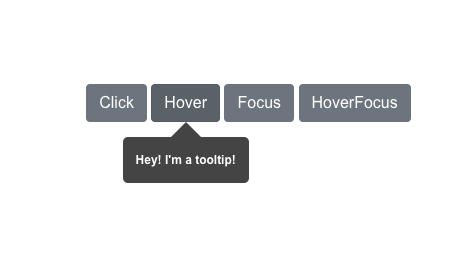
- Multiple Triggers (click, hover, focus, hoverfocus)
- Backdrops (black, white, blurred) - Only apply to trigger:'click'
- Themes (black, lt-gray, white, blue, green, red)
- Sizes (tiny, small, medium, large)
- Responsive (prefers the specified position, if it doesn't fit, it attempts to make it smaller by stacking the question and buttons, if it doesn't fit, it tries the "auto" setting, if it still doesn't fit, it shows as a modal in the middle of the screen)
- Tooltip hide/show events
- No-conflict CSS
Clone this repo to your website's public folder
OR
Available on NPM (https://www.npmjs.com/package/jtippy):
npm install jtippyjQuery 3.0+
Include the plugin in your code:
<link rel="stylesheet" href="jTippy-master/jTippy.min.css">
<script src="jTippy-master/jTippy.min.js"></script>
jTippy's defaults make it dead-simple to get started:
<a href='#'
    data-toggle="tooltip"
    title="There are many variations of passages of Lorem Ipsum available, but the majority have suffered alteration in some form, by injected humour, or randomised words which don't look even slightly believable.">
    There are many variations of...
</a>$(function(){
$('[data-toggle="tooltip"]').jTippy();
});Defaults are shown
$(function(){
  $('[data-toggle="tooltip"]').jTippy({
        //string/function(btn, jtippy):string returning string: overridden by the title attribute - function is run every time the tooltip is displayed and can be used to grab content via XHR/AJAX
        title: '',
        //string ('click', 'hover', 'focus', 'hoverfocus'): defines when the tooltip should be shown
        trigger: 'hoverfocus',
        //string ('auto','top','bottom','left','right'): preferred location of the tooltip (defaults to auto if no space)
        position: 'auto',
        //string ('black', 'lt-gray', 'white', 'blue', 'green', 'red')
        theme: 'black',
        //string ('tiny', 'small', 'medium', 'large')
        size: 'small',
        //string|false ('black', 'white', 'blurred'): Only works with trigger: "click"
        backdrop: false,
        //string: class(es) to add to the tooltip
        class: '',
        //boolean: if true, when this tooltip is triggered, all others will hide
        singleton: true,
        //boolean: if true and trigger: 'click', when clicking outside the tooltip, it will be hidden
        close_on_outside_click: true,
  }).on('jt-show', function(e, tooltip, hide){
      //triggered on show of tooltip
      //the tooltip's jquery dom object is provided as the second param
      //to hide the tooltip, run hide()
  }).on('jt-hide', function(e){
      //triggered on hide of tooltip
  });
});
You can set any of the options you see above globally using this syntax:
$.jTippy.defaults.backdrop = false;
$.jTippy.defaults.theme = 'black';
$.jTippy.defaults.trigger = 'hoverfocus';
You can override the global and passed options by setting data attributes:
<a href='#'
    data-toggle="tooltip"
    data-backdrop="black"
    data-trigger="click">
    Black backdrop!
</a>$('[data-toggle="tooltip"]').jTippy();