本教程将使用使用css background-clip:text 属性和CSS3 transitions来制作一些有趣的文字特效。
HTML结构:
<div class="it-wrapper">
    <h3>Andreas</h3>
</div>
在执行动画时,我们将用jQuery为容器的class添加上it-animate。
EXAMPLE 1
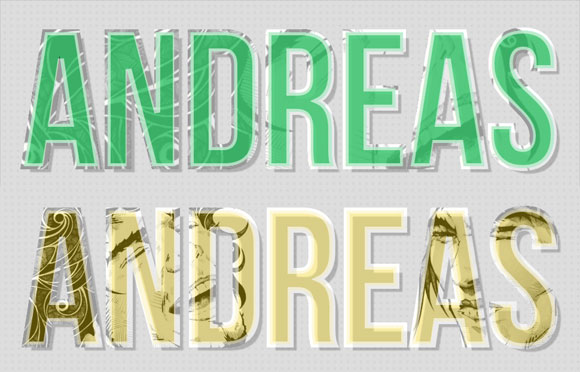
在第一个例子中我们要添加两个背景图片。开始的时候我们需要图片覆盖整个文字,所以要设置background为100%。在长宽比上,我们只给定了一个值,这意味着图片将保持原图片的长宽比。
当我们为文字设置背景图片吧和background-clip的时候,我们要确定文字的背景色是不是透明的,以确保能看到背景图片。我们使用rgba为文字设置颜色和透明度。我们还使用了-webkit-text-stroke为文字描上白色的边。
.it-wrapper h3{
    font-size: 320px;
    line-height: 188px;
    padding: 60px 30px 30px;
    color: rgba(67, 201, 117, 0.9);
    font-family: 'BebasNeueRegular', Arial, sans-serif;
    text-shadow: 10px 10px 2px rgba(0,0,0,0.2);

    -webkit-text-stroke: 10px rgba(255,255,255,0.6);

    background-color: #fff;
    background-repeat: no-repeat;
    background-image: url(../images/2.jpg), url(../images/1.jpg);
    background-position: 50% 50%;
    background-size: 100%;

    -webkit-background-clip: text;
    /* let's assume that one day it's supported */
    -moz-background-clip: text;
    background-clip: text;

    transition: all 0.5s linear;

    /* for now, let's just add some niceness for Firefox */
    -moz-border-radius: 30px;
    -moz-box-shadow: 0px 0px 1px 8px rgba(67, 201, 117, 0.2);
}
由于执意要webkit内核的浏览器才支持background-clip,我们在这里为firefox浏览器添加了一些回调。回调中我们放弃了背景图片,但是添加了一些好看的圆边和阴影效果。
我们需要制作的文字动画的样式如下。
.it-wrapper h3.it-animate{
    background-size: 50%;
    background-position: 0% 50%, 130% 50%;
    color: rgba(242, 208, 20, 0.4);

    -moz-box-shadow: 0px 0px 1px 8px rgba(242, 208, 20, 0.4);
}
图片的background size被减少到50%,并改变背景图片的位置,以使它从一边移动到另一边。
对于firfox浏览器我们只需要使它的阴影颜色发生变化。
EXAMPLE 2
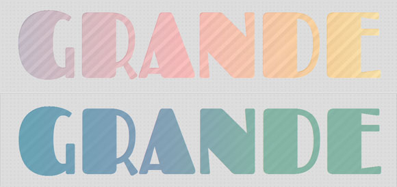
在第二个例子中我们使用吧背景颜色渐变效果。
第一个渐变是由许多颜色组成的线性渐变,第二个渐变是由条纹组成的重复线性渐变。
如果你想快速的制作一个渐变,我们建议你使用 ColorZilla 的在线渐变制作工具。这是一个强大的在线制作各种渐变的工具,如果你使用过photoshop,那么操作它就不再话下了。
这两种渐变效果的 background size 都要设置为宽度文字宽度的3倍,长度为100%。
.it-wrapper h3{
    font-size: 270px;
    line-height: 180px;
    padding: 30px 30px 40px;
    color: rgba(255,255,255,0.1);
    font-family: 'Fascinate', 'Arial Narrow', Arial, sans-serif;
    text-shadow: 1px 1px 1px rgba(255,255,255,0.3);

    background:
        linear-gradient(
            left,
            rgba(105,94,127,0.54) 0%,
            rgba(255,92,92,0.57) 15%,
            rgba(255,160,17,0.59) 27%,
            rgba(252,236,93,0.61) 37%,
            rgba(255,229,145,0.63) 46%,
            rgba(111,196,173,0.65) 58%,
            rgba(106,132,186,0.67) 69%,
            rgba(209,119,195,0.69) 79%,
            rgba(216,213,125,0.7) 89%,
            rgba(216,213,125,0.72) 100%
        ),
        repeating-linear-gradient(
            -45deg,
            rgba(255,255,255,0.5),
            transparent 20px,
            rgba(255,255,255,0.3) 40px
        );

    background-size: 300% 100%;
    background-position: center left, top left;

    -webkit-background-clip: text;
    -moz-background-clip: text;
    background-clip: text;

    transition: all 1.8s linear;

    -moz-border-radius: 90px 15px;
    -moz-box-shadow: 0px 0px 0px 10px rgba(255,255,255,0.4);
}
对于firfox浏览器我们添加一些border radius和一些阴影。
下面是渐变动画效果。
.it-wrapper h3.it-animate{
    background-position: center right, top right;
    color: rgba(39,137,149,0.5);

    -moz-box-shadow: 0px 0px 0px 10px rgba(39,137,149, 0.9);
}
EXAMPLE 2

在最后一个例子中,我们希望制作一种背景图片从非常大缩小到100%大小的效果。
.it-wrapper h3{
    font-size: 180px;
    line-height: 180px;
    padding: 20px 30px;
    color: rgba(0,80,81,0.7);
    -webkit-text-stroke: 2px rgba(0,0,0,0.5);
    font-family: 'Gravitas One', 'Arial Narrow', Arial, sans-serif;
    text-shadow: 15px 15px 1px rgba(255,255,255,0.3);

    background-image: url(../images/3.jpg);
    background-repeat: no-repeat;
    background-position: center center;
    background-size: 400%;

    -webkit-background-clip: text;
    -moz-background-clip: text;
    background-clip: text;

    transition: all 0.3s linear;

    -moz-box-shadow:
        -10px -10px 0px rgba(255,255,255,0.4),
        10px 10px 0px rgba(0,81,81,0.4),
        0px 0px 50px 50px rgba(255,255,255,0.9) inset;
}
除了background size,我们也使用rgba来为firefox改变透明度和设置一些阴影效果。
.it-wrapper h3.it-animate{
    background-size: 100%;
    color: rgba(0,80,81,0.1);
    -moz-box-shadow:
        -20px -20px 0px rgba(255,255,255,0.4),
        20px 20px 0px rgba(0,81,81,0.4),
        0px 0px 40px 0px rgba(255,255,255,0.4) inset ;
}
本教程就到这里,希望对你有所帮助。